How to make a Gantt chart in Google Sheets

Google Sheets has no Gantt chart type, so you make one of two ways: build a stacked bar chart and hide the first series, or colour a grid of dates with conditional formatting. Both work, both take about fifteen minutes the first time, and both are genuinely fine for a plan of ten or fifteen tasks that does not change much. The full steps for each are below, along with an honest account of where the spreadsheet approach stops paying for itself.
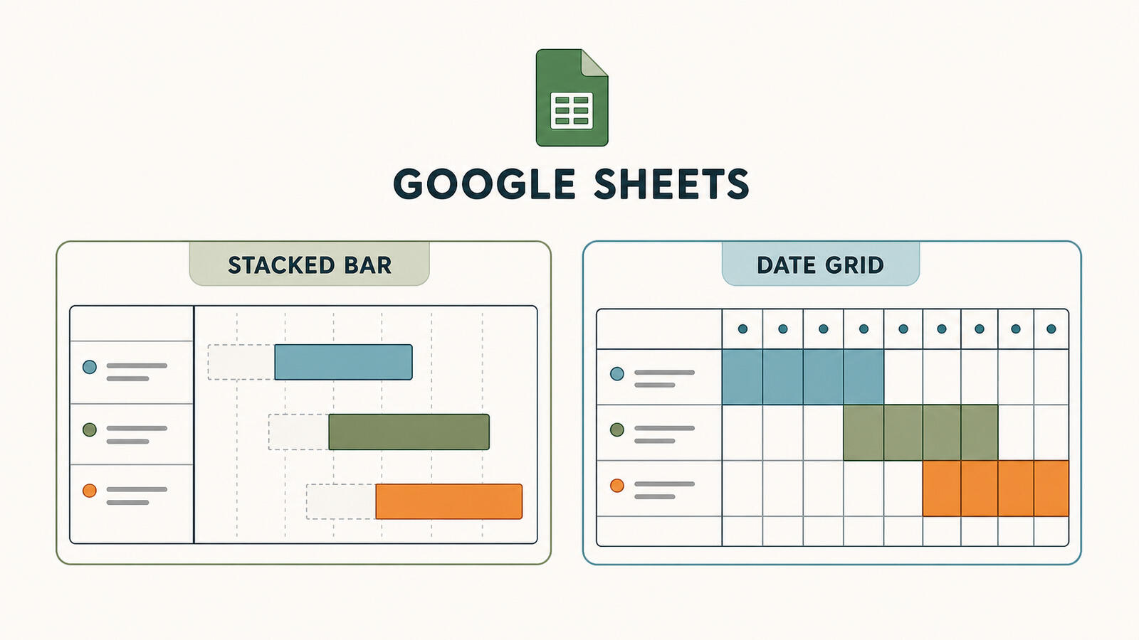
Method 1: the stacked bar chart
This produces a proper chart object with clean bars, and it is the method most Google Sheets Gantt templates use. The trick is that a bar has to start somewhere, so you chart an invisible bar first to push the visible one into position.
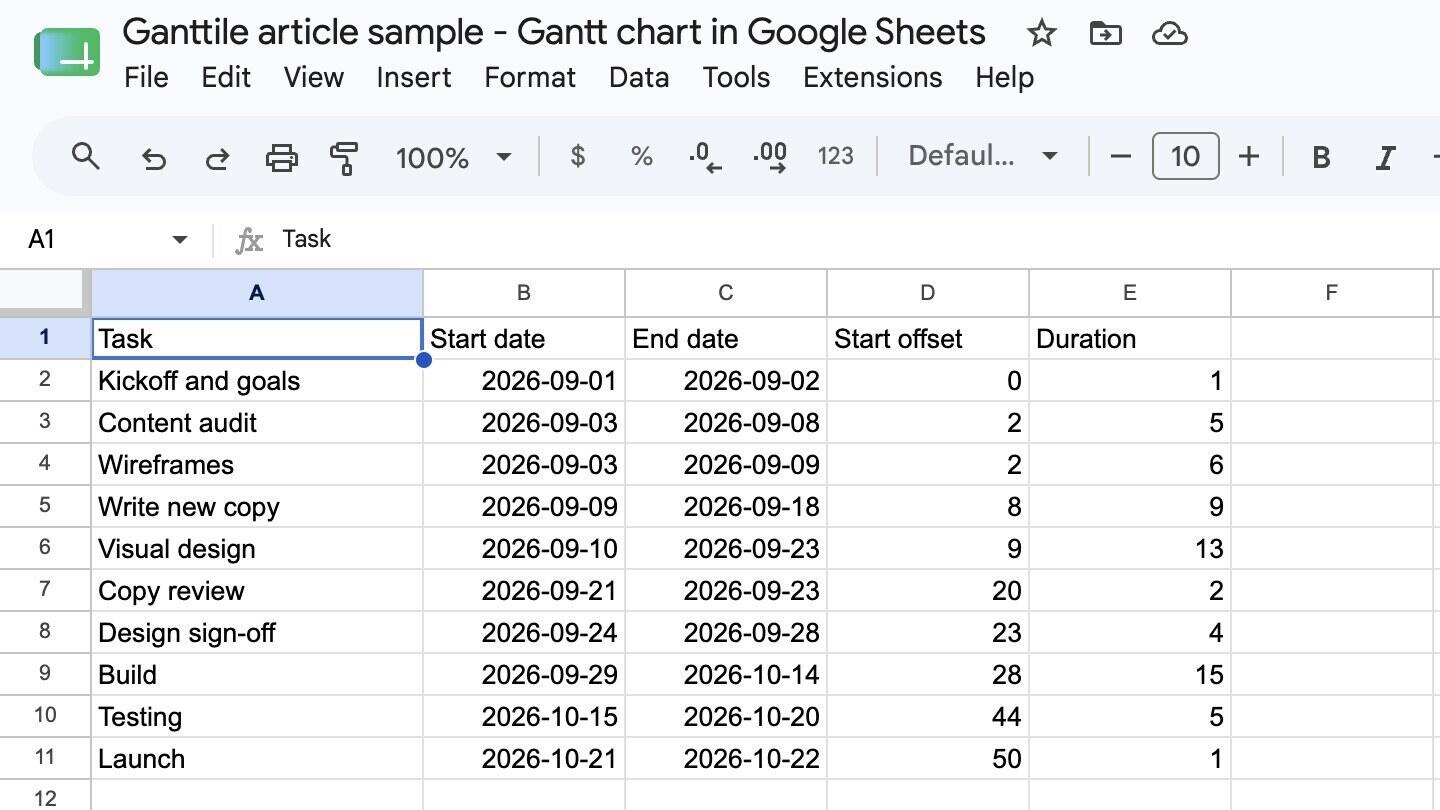
Set up four columns:
- Column A - Task. One row per task.
- Column B - Start date. Real dates, formatted as dates.
- Column C - End date. Also real dates.
- Column D - Start offset. The formula is =B2-$B$2, filled down. This gives the number of days between the project's first start date and each task's start.
- Column E - Duration. The formula is =C2-B2, filled down.
Then build the chart:
- Select column A, then hold Ctrl or Cmd and select columns D and E, so you have the task names plus the two number columns and not the raw dates.
- Go to Insert > Chart.
- In the chart editor, set the chart type to Stacked bar chart.
- Check the Series order. Start offset has to be the first series, or the bars stack the wrong way round. If Duration is listed first, remove it and add it again so it lands second.
- Open the Customize tab, then Series, and select the Start offset series.
- Set its Fill opacity to 0%. The offset bars disappear and the duration bars are left floating in the right places. Older guides tell you to set the fill colour to None, but current Sheets has no None option in the colour picker - opacity is where this now lives.
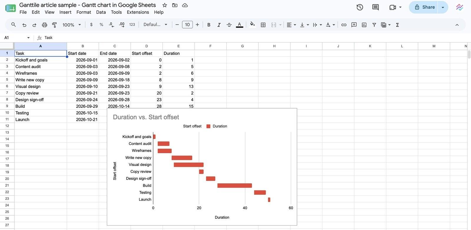
That is the whole method. The result reads like a real Gantt chart and looks good enough to put in a document or a client update, which is usually why people want the chart object rather than the coloured grid. Tasks appear top to bottom in the order of your rows, so there is no need to reverse the axis.
Three things that catch people out. The offset formula has to be anchored with dollar signs to the project's first start date, or every row measures from itself and every bar starts at zero. If a task's start date is earlier than the one in row 2, the offset goes negative and the chart breaks, so sort the rows by start date before you build it. And Sheets will often guess the wrong field for the vertical axis - if the labels come out as numbers rather than task names, set the Y-axis to the Task column in the Setup tab.
Method 2: conditional formatting on a date grid
This one produces no chart object at all. You build a calendar grid in the sheet itself and colour the cells that fall inside each task. It looks less polished and it is much easier to live with.
- Put your task names down column A, start dates in column B and end dates in column C.
- From column D onward, put one date per column across row 1 - daily for a short project, weekly for a long one. Fill them across so they increment automatically.
- Select the whole grid from D2 to the far right and bottom of your task rows.
- Go to Format > Conditional formatting, and choose Custom formula is.
- Enter =AND(D$1>=$B2, D$1<=$C2) and pick a fill colour.
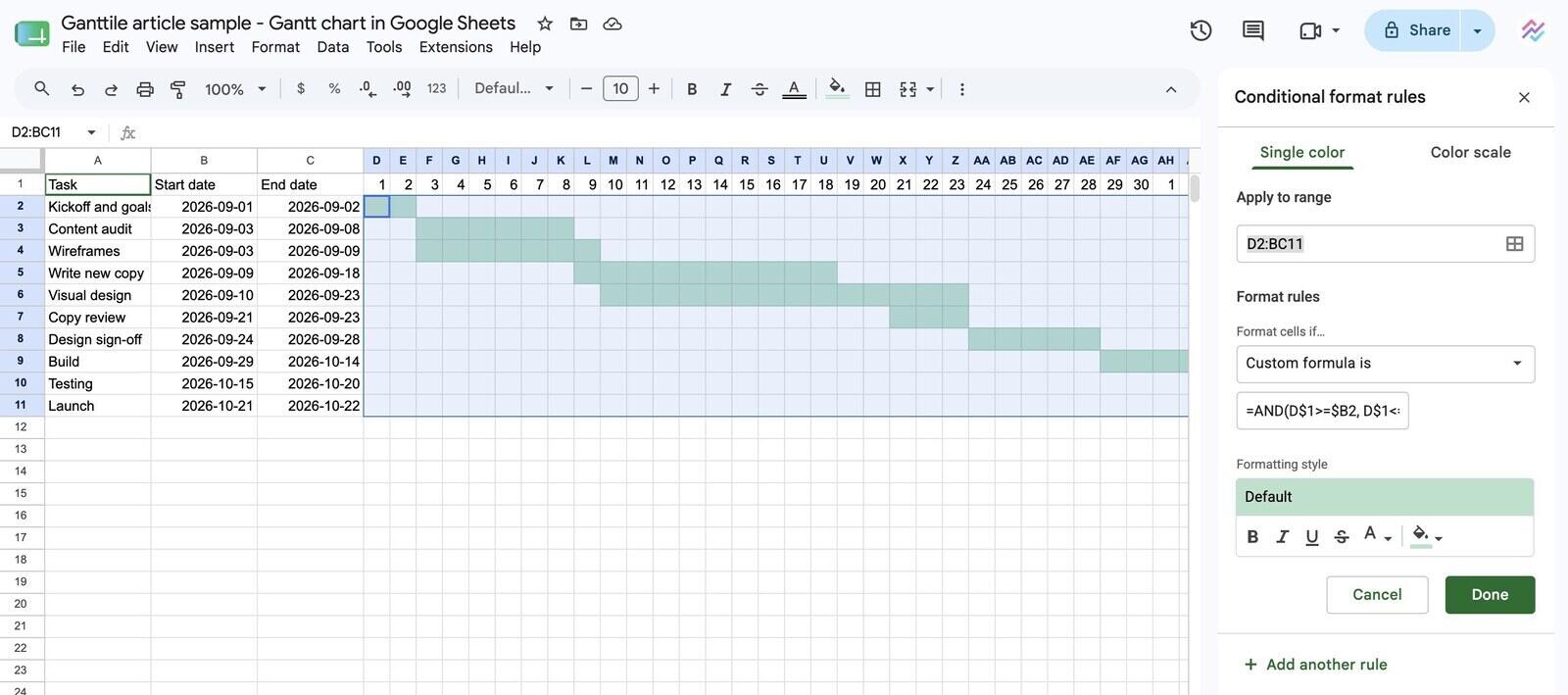
Every cell whose column date falls between that row's start and end now fills in, and the bars appear. The mixed anchoring matters: the dollar sign before the 1 locks the date row, the dollar signs before B and C lock the date columns, and the rest moves with the cell.
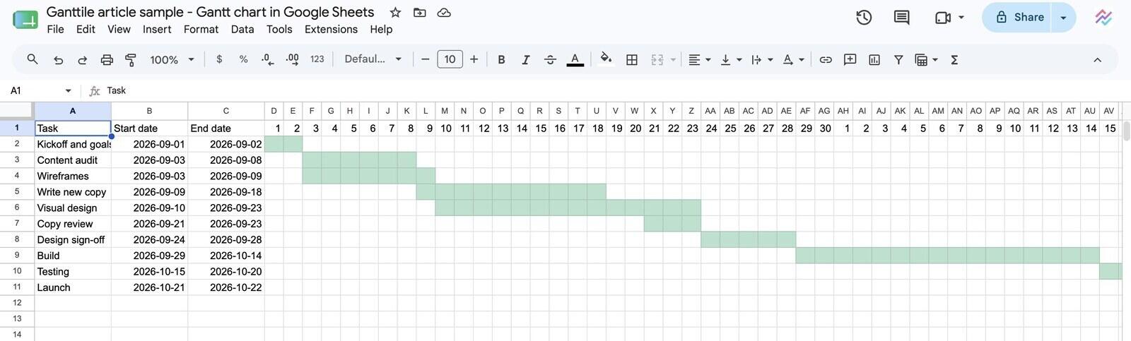
The advantage is that changing a date changes the picture instantly, with no chart to rebuild and no series to re-hide. If you are going to keep the plan updated rather than produce it once, this is the method to use. You can add a second rule with a different colour for completed work, or one that highlights today's column, and it stays readable.
Which method should you pick?
Pick the stacked bar chart if the output matters more than the maintenance, and conditional formatting if it is the other way round.
| Area | Stacked bar chart | Conditional formatting |
|---|---|---|
| Setup time | 10 to 15 minutes | 5 to 10 minutes |
| Looks like a real Gantt chart | Yes, it is a chart object | Roughly, it is coloured cells |
| Updating dates | Works, but long plans need the chart range extended | Instant, nothing to rebuild |
| Adding tasks later | Chart range has to be edited each time | Just add a row inside the formatted range |
| Exports and screenshots | Clean, copy the chart straight out | Screenshot only |
If you are choosing between a spreadsheet and something built for the job in the first place, that is a different question, and it is covered in the comparison of spreadsheets against Gantt tools.
What stops working once the plan starts moving?
Dependencies. That is the honest answer, and it is not a small one. In Google Sheets every date is a value somebody typed. Nothing knows that testing follows build, so when build slips by three days, nothing moves. You reopen the sheet and edit every downstream date by hand, and the day you miss one, the plan is quietly wrong.
On a stable plan this costs nothing, which is why the spreadsheet approach genuinely is fine for a lot of projects. On a plan that changes weekly it is a recurring tax, and the failure is not the effort, it is that the sheet slowly stops matching reality until nobody trusts it. That is the real end state of most spreadsheet plans: not abandoned, just no longer believed.
Three other things Sheets will not do for you:
- Show the critical path. Without dependencies there is no chain to trace, so you cannot tell which tasks are actually setting your end date.
- Keep a baseline. Comparing where a task was planned to be against where it is means keeping a second copy of the dates and diffing them yourself.
- Handle collaborative edits well. Sheets shares beautifully, but a shared plan where anyone can retype a date and nothing recalculates tends to drift.
A reasonable rule of thumb: if you have rebuilt the same sheet twice because the dates got tangled, the spreadsheet has finished being the cheap option.
When is it worth moving off the spreadsheet?
Move when tasks genuinely depend on each other and the plan changes often enough that you are maintaining dates by hand. Those two conditions together are what a purpose-built chart solves, and neither is about how many tasks you have.
The switch does not have to mean project management software. A dedicated Gantt tool is a much smaller step than a full project platform, and for a lot of teams it is all that was needed. Ganttile is free and works in the browser, so linking tasks and having later dates shift on their own takes about as long as the stacked bar setup above, without the offset column. If your project also needs boards, comments, files and reporting around the timeline, that is when a broader tool like Breeze starts making more sense than a chart on its own.
If you would rather stay out of spreadsheets entirely but are not sure what replaces them, the guide on building a chart without Excel covers the same ground from the other direction.
Common questions about Gantt charts in Google Sheets
- Does Google Sheets have a Gantt chart template?
- Not in the default template gallery. Google's project management templates include timelines and task trackers, but a Gantt chart still has to be built with one of the two methods above, or copied from a third-party template.
- Will the chart survive being exported to Excel?
- The stacked bar chart usually converts, since Excel builds Gantt charts the same way. Conditional formatting rules mostly carry over too, but check the custom formula after conversion - the anchoring sometimes shifts.
- Can I show percent complete on the bars?
- With the conditional formatting method, yes: add a completion column and a second rule that colours the finished portion differently. With the stacked bar method it means adding another series, which is where these builds usually start becoming more trouble than they are worth.
Where to start
If you need a chart to show someone once, use the stacked bar method and export it. If you are going to keep the plan alive, use conditional formatting, and accept that you will be updating dates by hand whenever something slips.
 Breeze
 Timen
Timen


