- Templates |
- Simple Gantt Chart
Simple Gantt chart template
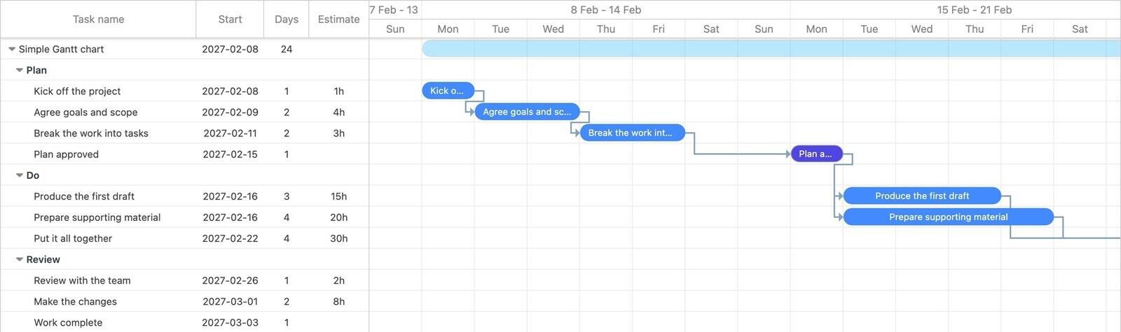
This is the smallest useful Gantt chart we could build: three phases, ten tasks, a handful of dependencies and two milestones. It is meant as a starting point when you want a real schedule without spending an afternoon setting one up, and as a plain example of what a Gantt chart looks like when the tasks are actually linked together.
- 3 phases
- 8 tasks
- 2 milestones
- 10 dependencies
- About 4 weeks
What is in this template?
The work is split into three phases. Each one is a group on the chart, with its tasks nested underneath.
| Phase | What happens | Tasks |
|---|---|---|
| Plan | Agree what you are doing and break it into pieces small enough to schedule. Ends on a Plan approved milestone. | Kick off the project · Agree goals and scope · Break the work into tasks · Plan approved |
| Do | The main work. Two tasks run in parallel and both have to finish before the third can start, which is the most common shape in a real plan. | Produce the first draft · Prepare supporting material · Put it all together |
| Review | One review pass, the changes that come out of it, and a Work complete milestone to close the project. | Review with the team · Make the changes · Work complete |
How do you use it?
Open the preview first. It is the whole chart, read-only, with no account needed, so you can see how the phases and arrows fit together before deciding whether the shape suits your work.
When you click Use template, a copy lands in your own account and the schedule is re-dated to start on the coming Monday. The spacing between tasks is kept exactly as it is here, so you do not have to unpick a set of dates from 2027. After that it is an ordinary project: rename the placeholder tasks, drag the bars to the durations you actually need, and delete anything that does not apply.
Two things are worth keeping as you edit. The dependencies are what make the chart useful, because they are what makes a slipped task push everything after it. And the two milestones give you something to point at in a status update without walking anyone through every row.
When is a simple template the right one?
Use this one when the project is short, the phases are obvious, and you mainly want the timeline visible. It suits a piece of work that runs a few weeks with one team involved: a small campaign, a report, a website page, an internal change.
It is the wrong starting point if you need to coordinate several teams, track a long chain of hand-offs, or work to a fixed external deadline. Those need more structure than three phases, and the larger templates are a better fit. If you are not sure whether a Gantt chart is the right tool at all, Gantt chart vs kanban board is the shorter way to decide.
Common questions
Is this Gantt chart template free?
Yes. The preview opens without an account, and copying the template into your own Ganttile account is free. There is no trial and no card required.
What dates will the copy use?
The whole schedule is shifted so the first task starts on the coming Monday. The gaps between tasks are preserved exactly, so you get a plan that begins now instead of a set of demo dates.
Can I change the phases and tasks?
Yes. Once the template is in your account it is an ordinary project. You can rename or delete any phase or task, drag the bars to change dates, add dependencies and invite other people to it.
Do I need to download anything?
No. Ganttile runs in the browser. There is no Excel file to download and no software to install.
How is this different from a Gantt chart in Excel?
In a spreadsheet the bars are formatting, so nothing moves when a date changes. Here the tasks are linked, so moving one date moves everything that depends on it. Excel vs an online Gantt chart goes into the trade-offs.
 Breeze
 Timen
Timen


